Current Experience
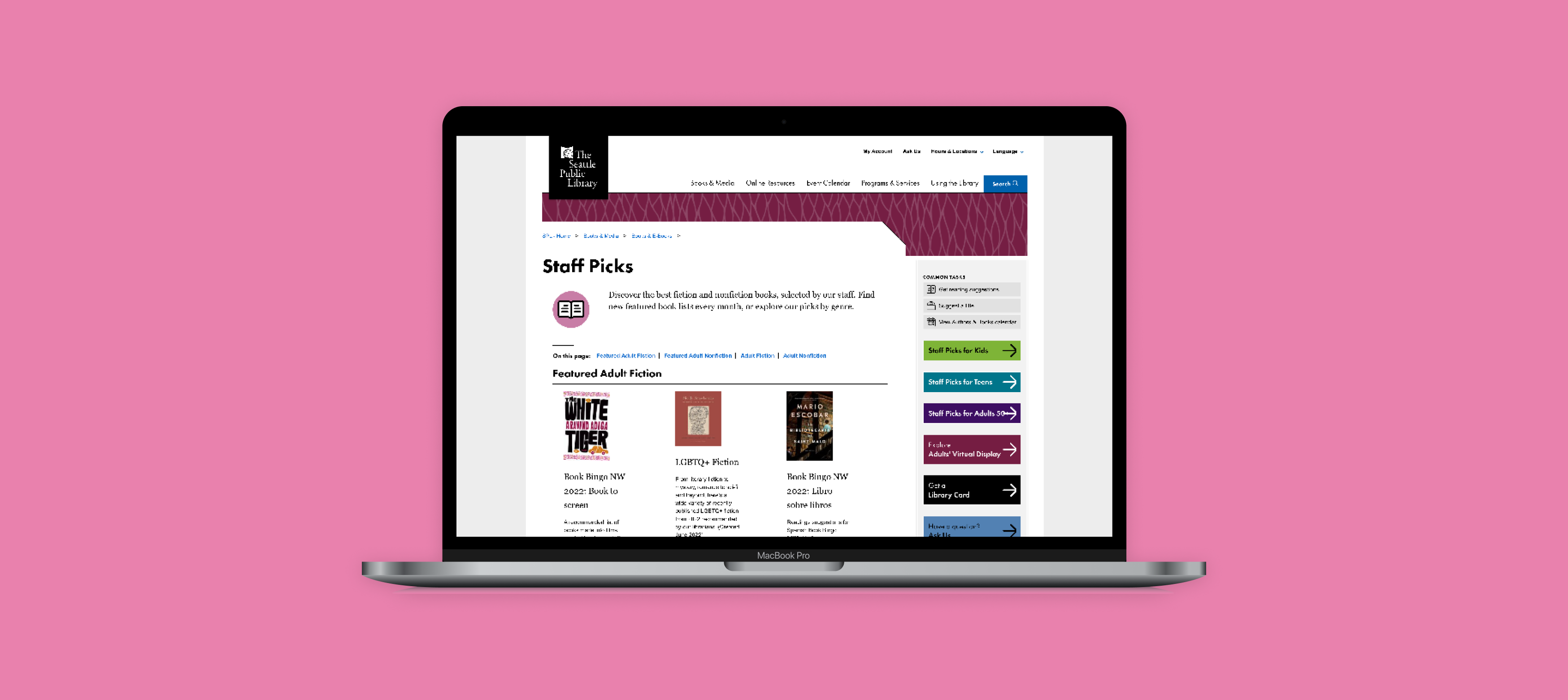
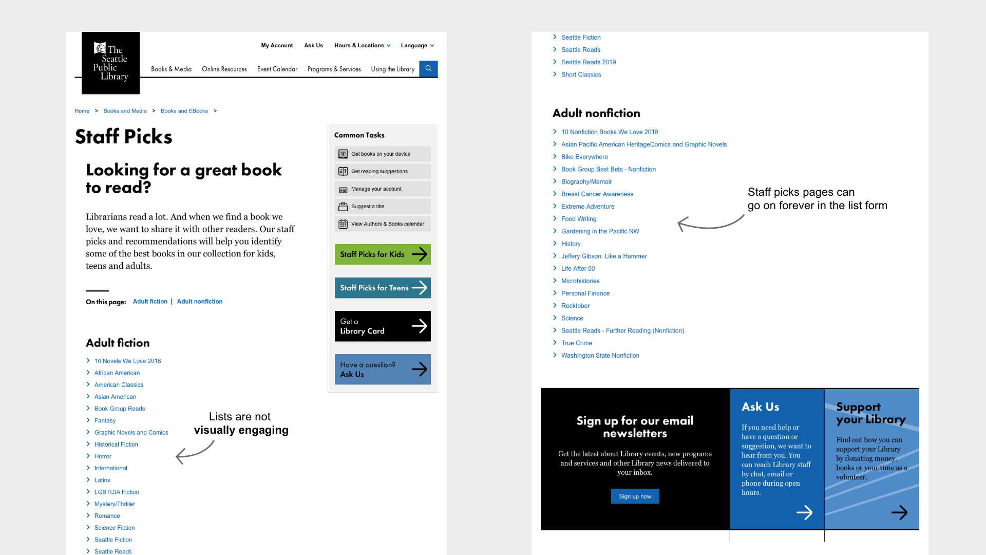
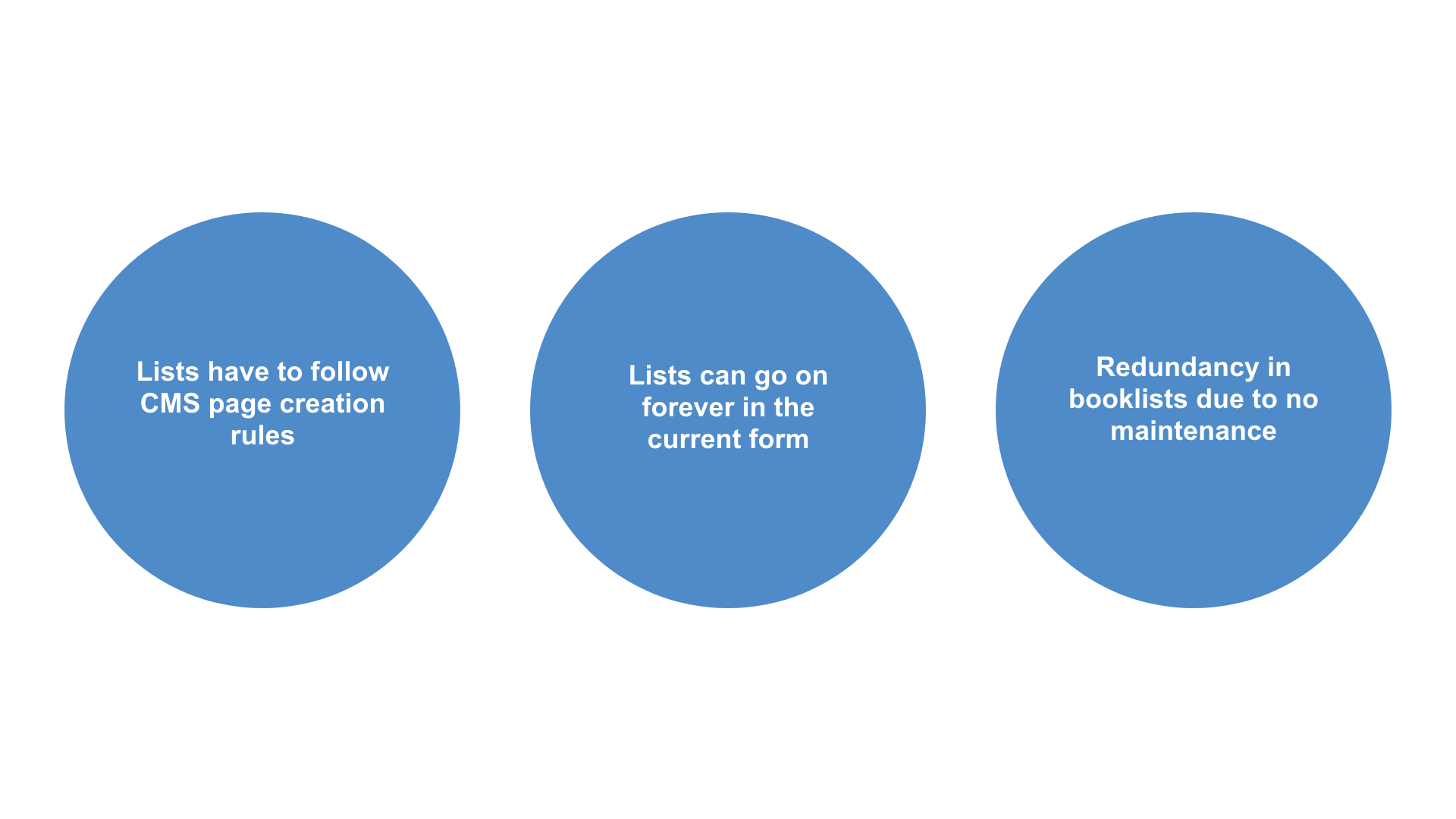
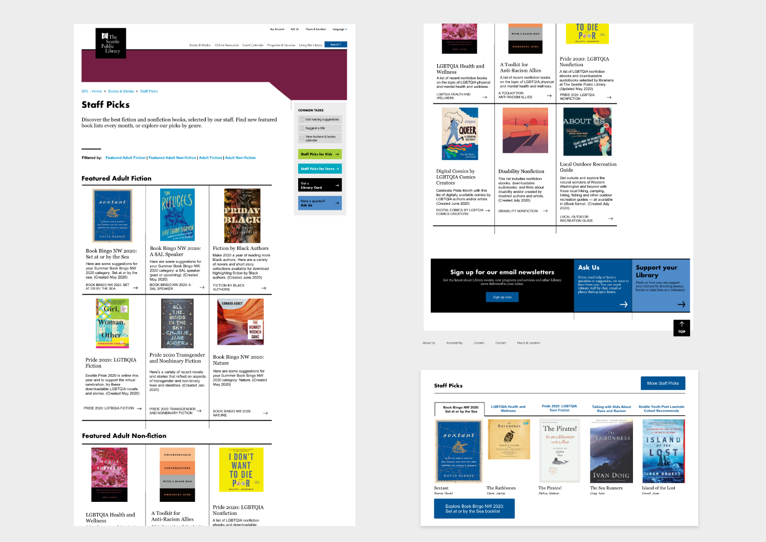
The current experience is unengaging and cumbersome. While users can access recommended books through the list, users have to read through each list title in order to determine if it fits their interests and needs.

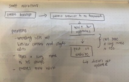
Staff workflow:
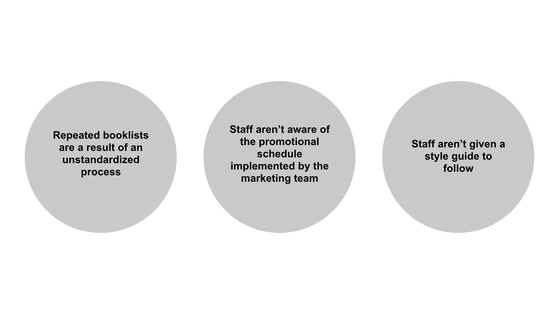
On the backend, the approval process to get a booklist onto the website makes it difficult for staff to maintain current booklists, therefore resulting in out of date and redundant booklists.

Approach
To improve the experience, I anchored the redesign through three approaches:
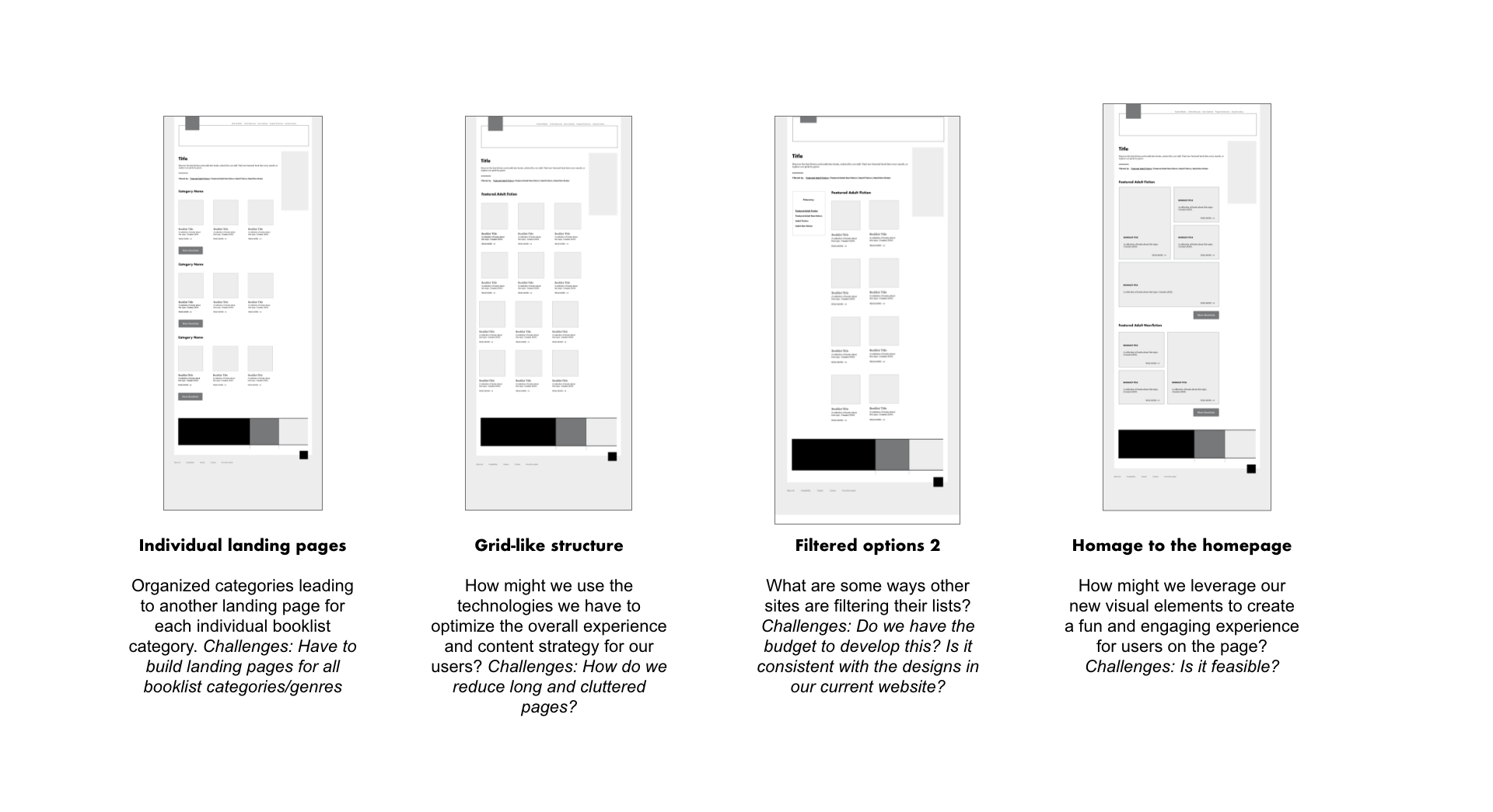
- Consistent styles: How might we leverage our new visual elements to create a fun and engaging experience for users on the page?
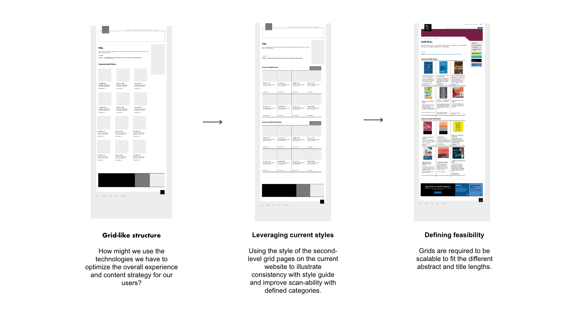
- Leveraging current technologies: How might we use the technologies we have to optimize the overall experience and content strategy for our users?
- Intercepting and increasing interests: How might we increase the engagement for already interested users on our website?
Research
Comparative Analysis
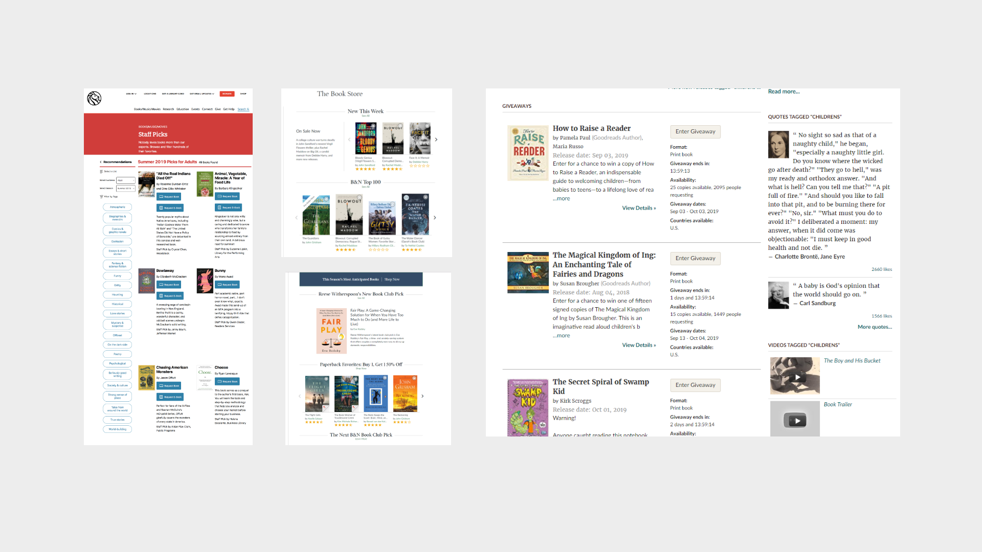
I looked at websites with a recommendation list or something similar as inspiration for how we can approach our re-design.

Stakeholder Interviews
I interviewed the web manager in charge of developing/maintaining the current booklist pages to gain a better understanding of how it was developed and currently being maintained.
Additionally, I also interviewed content-owners, booklist creators and the web content librarian in charge of promotion schedules for booklists to find the pain points in the current workflow and how we can improve on those to create a more seamless and effective workflow for all.
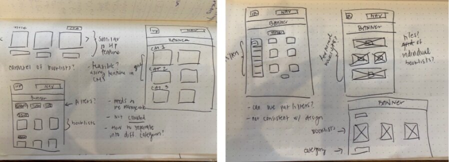
Sketches

Wireframes
I explored four different types of booklist layout options to determine the optimal way to display booklists.

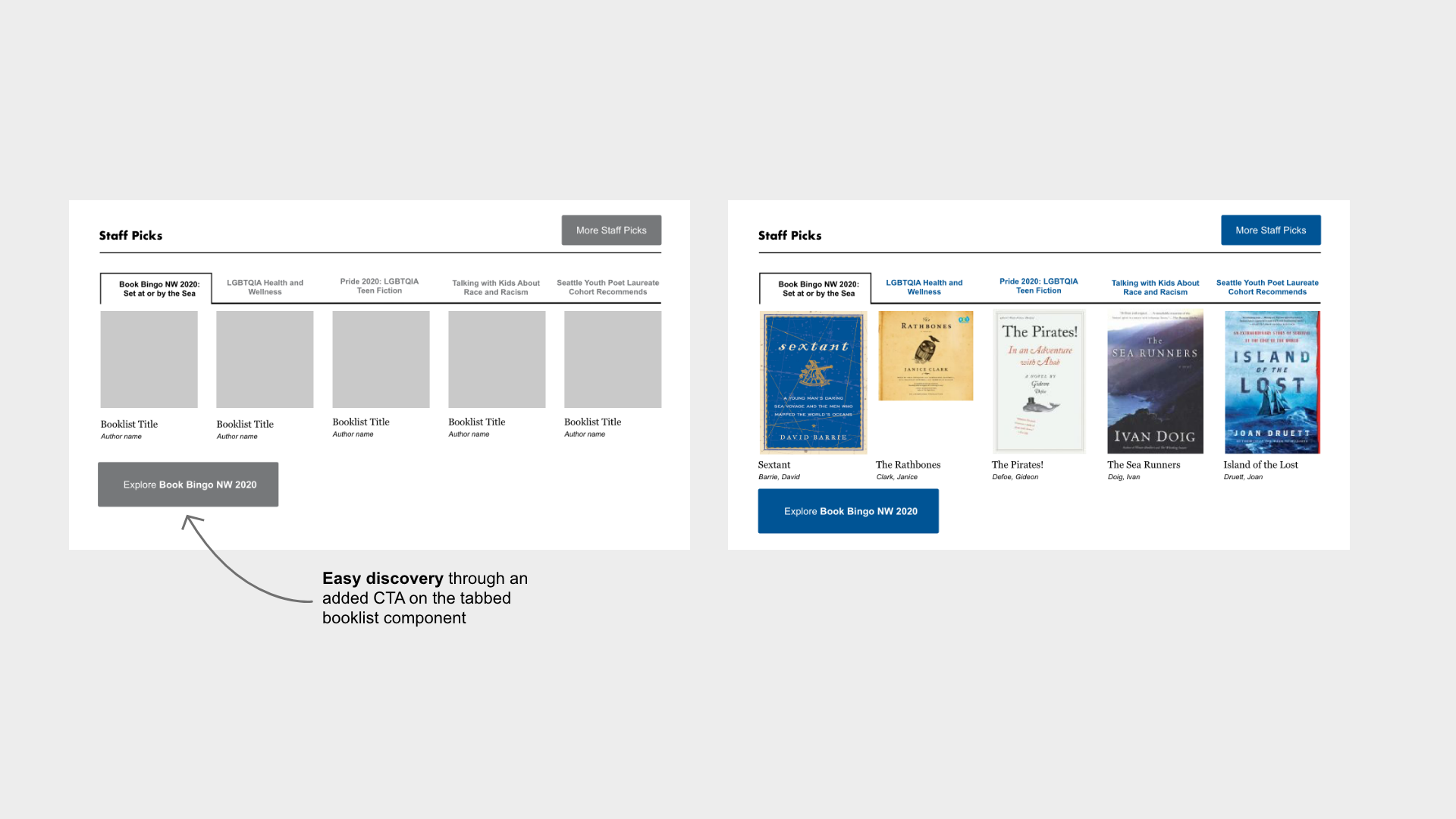
Additionally, I also explored different ingress points to these booklists on the homepage in order to improve the discovery of these booklists.

Revision and Hi-fidelity Mockup
Through user research, I narrowed down a layout option that tested well with patrons, in addition to being the most technically feasible option to meet our launch deadline.

Handoff
Improving Discovery:
- Clearly defined CTAs on the homepage to bring users to the featured booklist
- Direct users to booklists as related to their interests/wherever they are on the website
Leveraging current technologies:
- Utilized tile/grid designs to match look and feel of the overall website
- Used Bibliocommons API to fetch information/annotations created by librarians/booklist owners
- Used page creation rules on the CMS to automatically organize content into aggregated grid
Refreshed workflow for stakeholders:
- A decision flow for booklist creators to ensure that booklists are not being repeated
- A recipe guide on what to include in the content made it helpful for our search engine to pick up the keywords in booklists
- Booklist creators can now update the evergreen booklists and the content will automatically be updated through the Bibliocommons API

Outcome
The response we got from patrons and staff was that it was much more intuitive, the page was easier to navigate and visit rates and time spent on the pages have increased from the previous month.
Next Steps
To continue monitoring user feedback, iterate on the booklists, and explore mobile options.
