Intended Vision
The intended vision of this project was to:
- Help users identify and locate local social services and community resources through a centralized experience
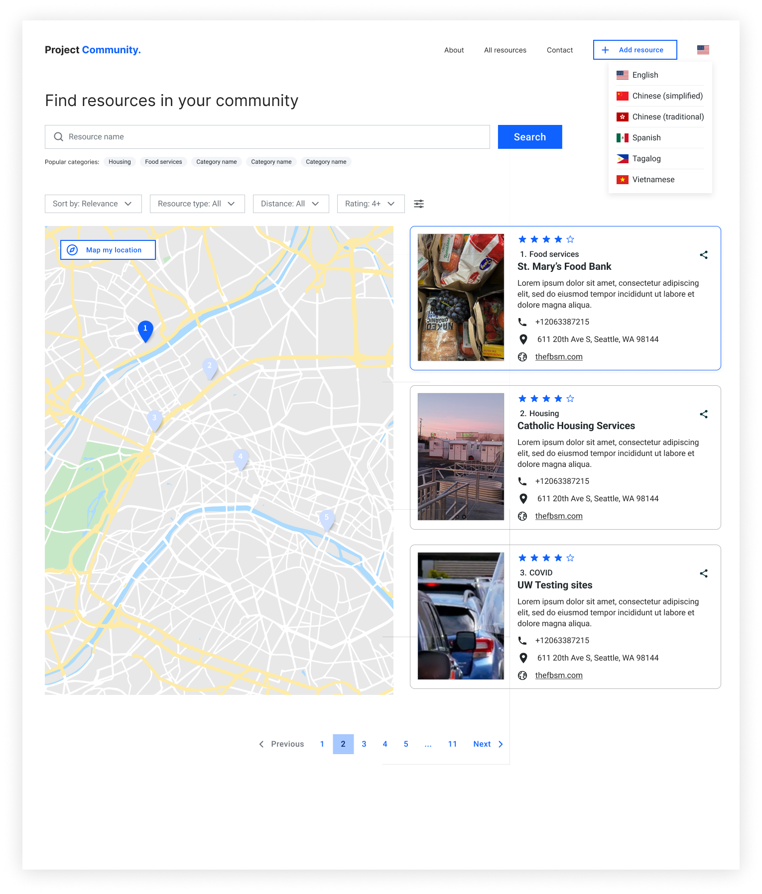
- Eliminate language barriers in accessing social services information by enabling language selectors
- Enable access to updated and reliable information regarding social services through real-time updates and user submission
Exploration
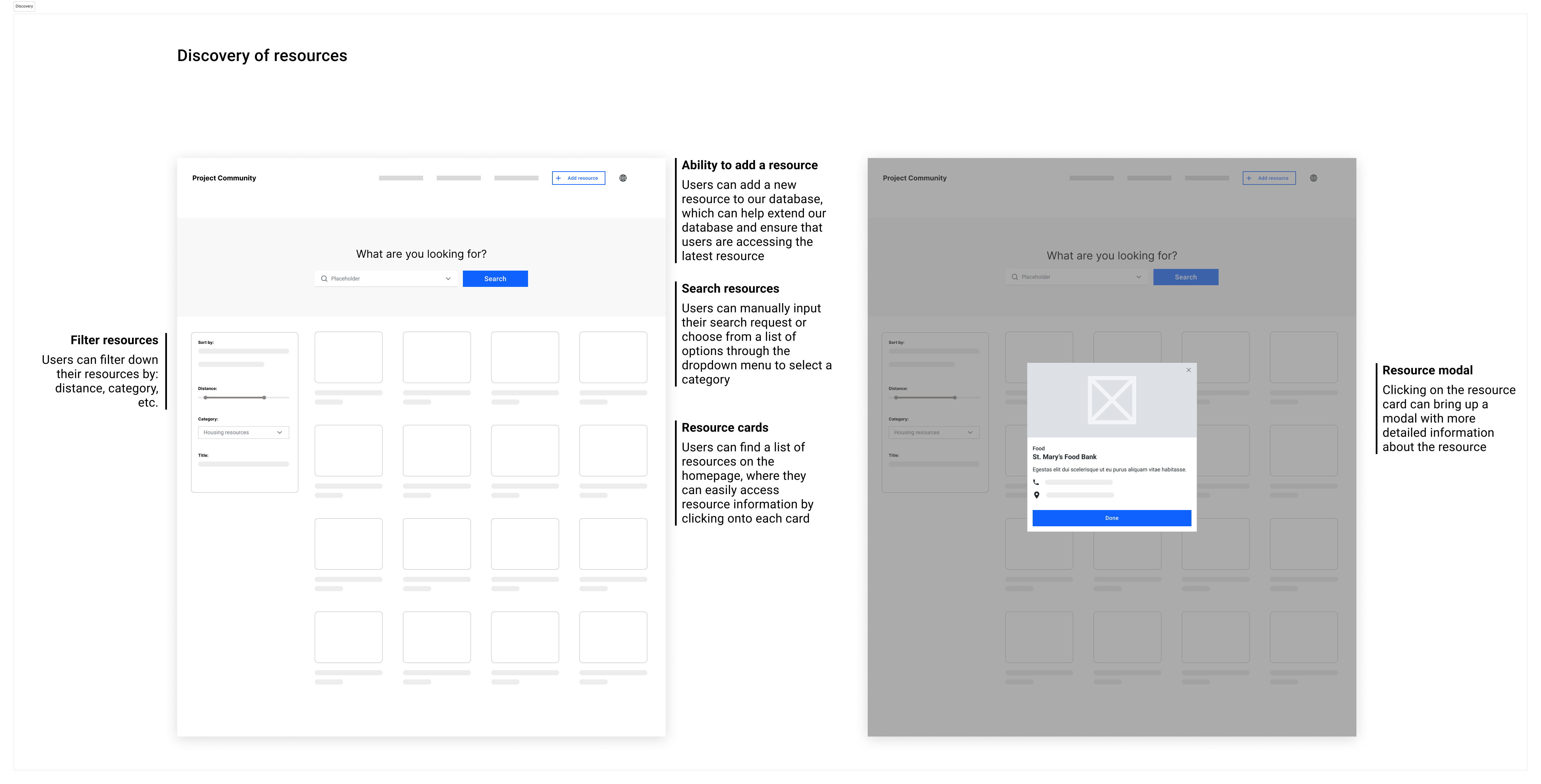
The initial design focused on two core features:
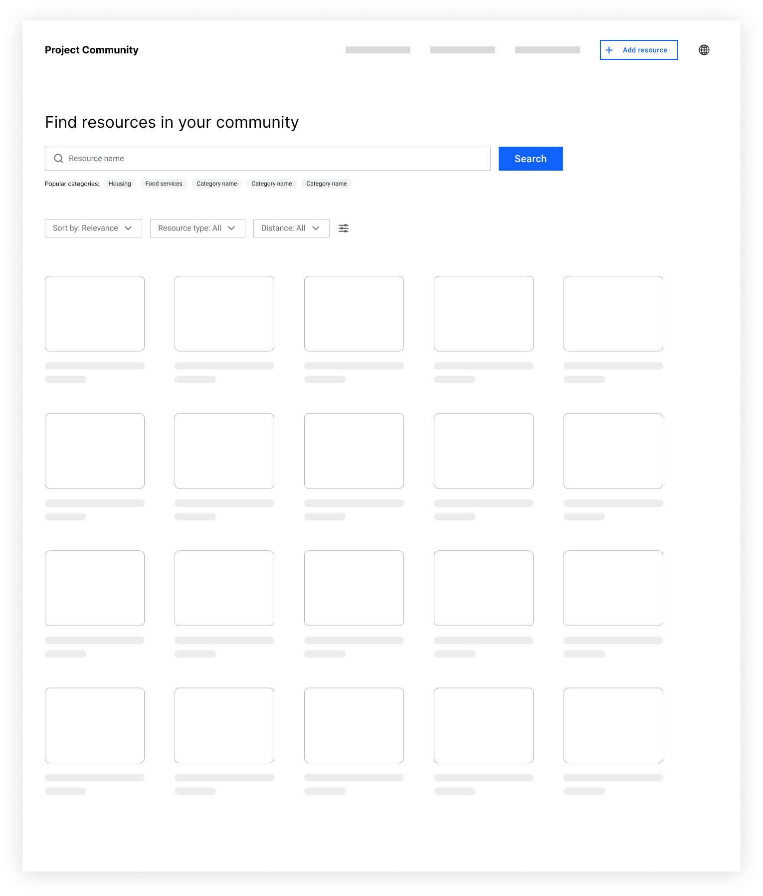
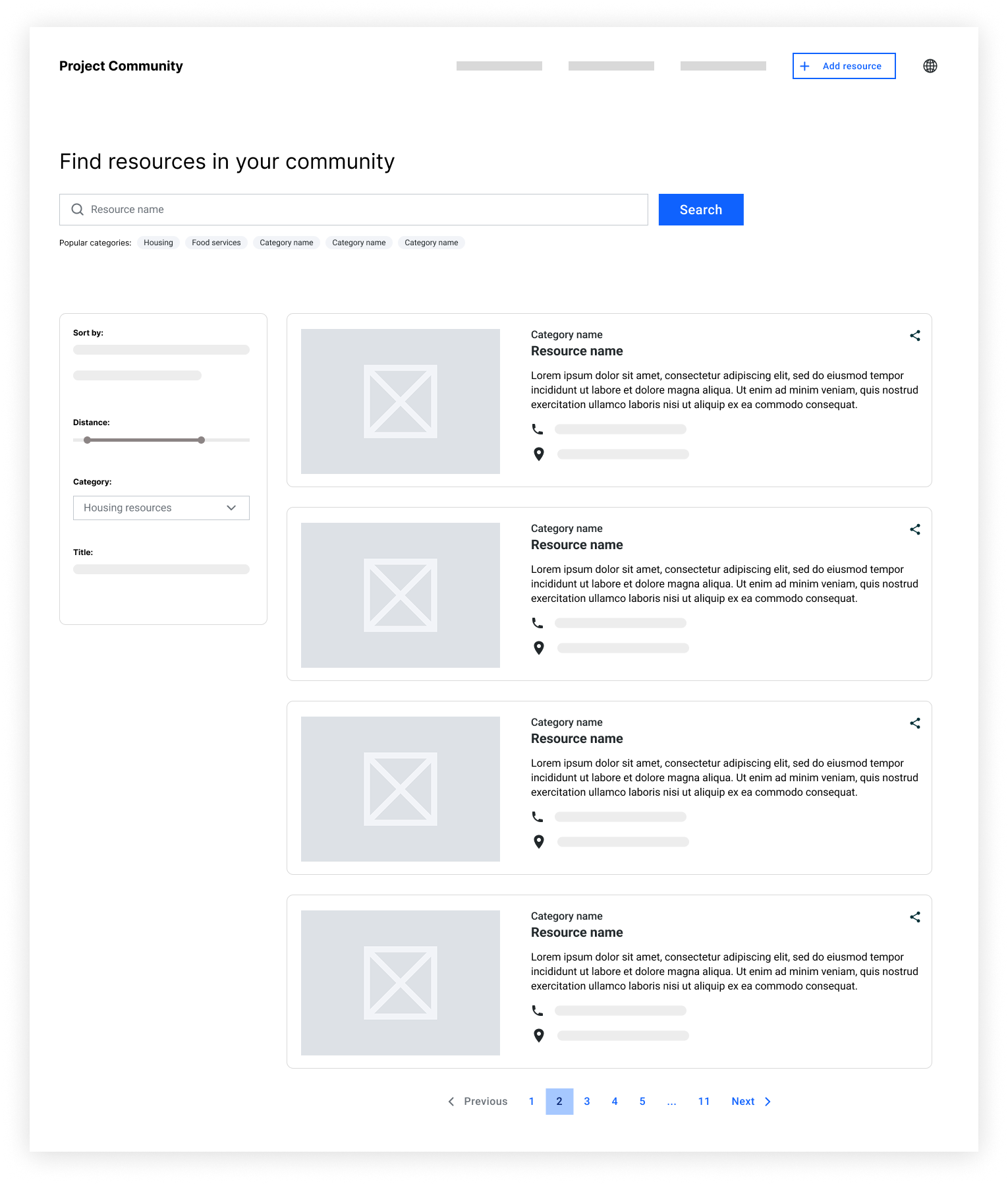
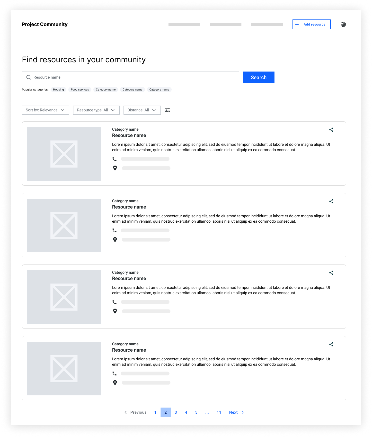
- Ability to view, search, and filter list of resources
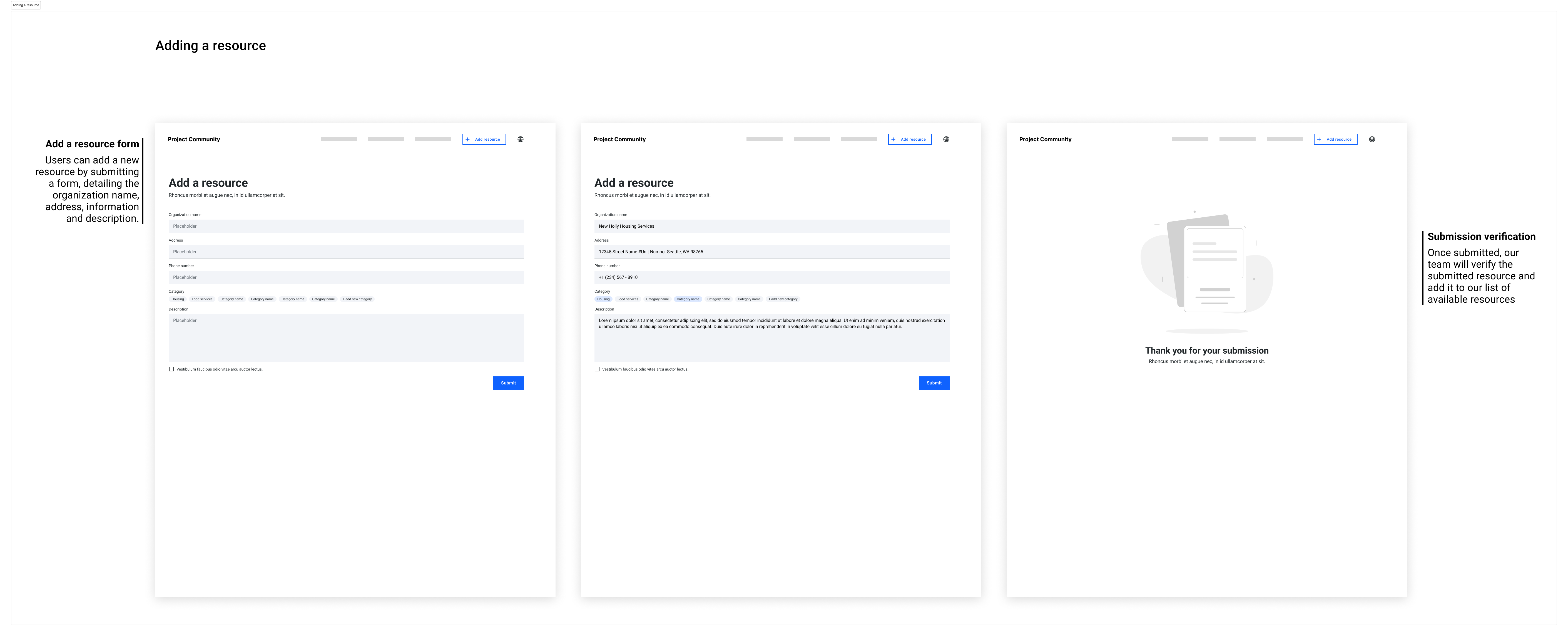
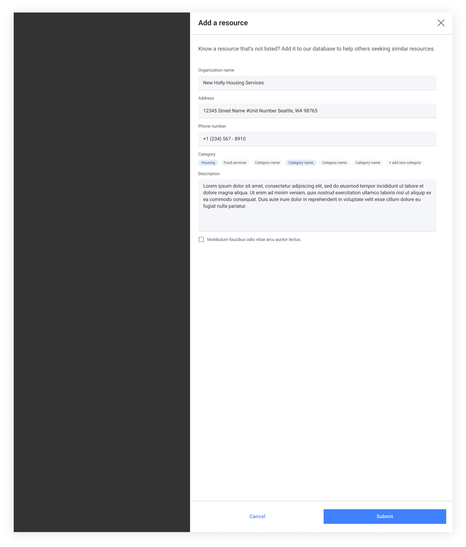
- Addition of new resources


User Testing & Feedback
To validate the initial design we:
- Interviewed 5 users to gather feedback on the proposed designs
- Presented the V1 mocks to users for their thoughts on: the designs, what problems are we trying to solve based on the proposed designs, what do they like/dislike about it
Feedback
Key insights from the interviews were:
- Users generally understood the intention of the designs
- They thought that the list format was overwhelming
- Ability to filter was a plus, as it helps them narrow down the resources
- Would want the ability to filter to be more automated (i.e. what are some popular resources? how do we present just enough information that it’s not too overwhelming or intimidating for sellers)
What changed in V2?
From the research insights I:
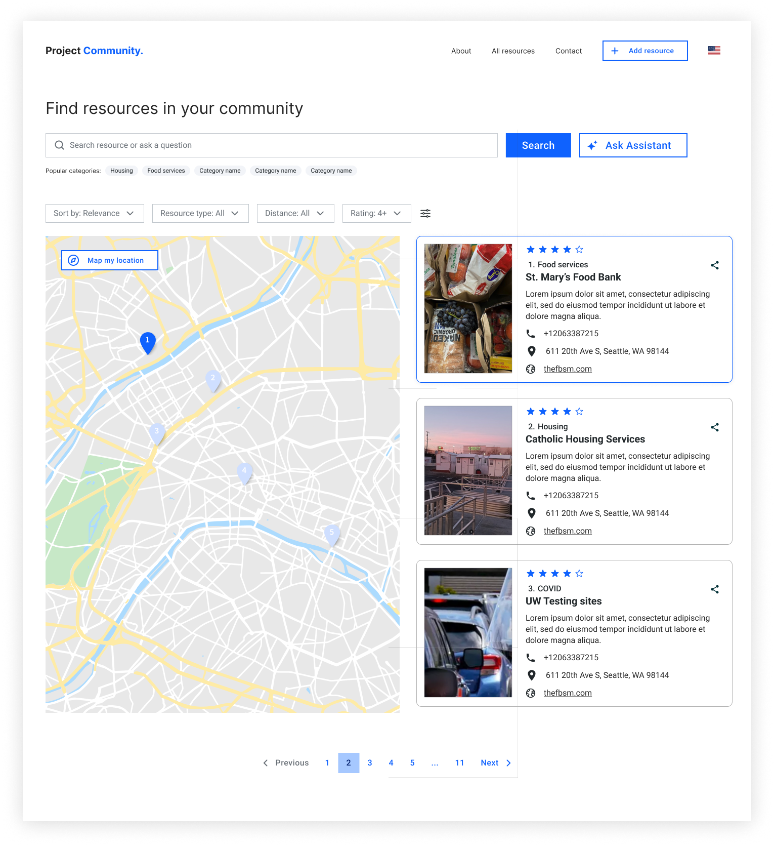
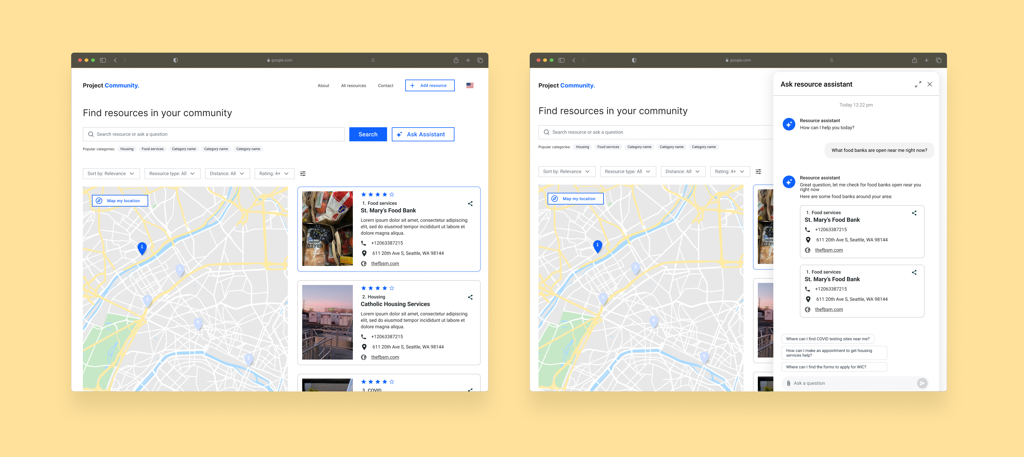
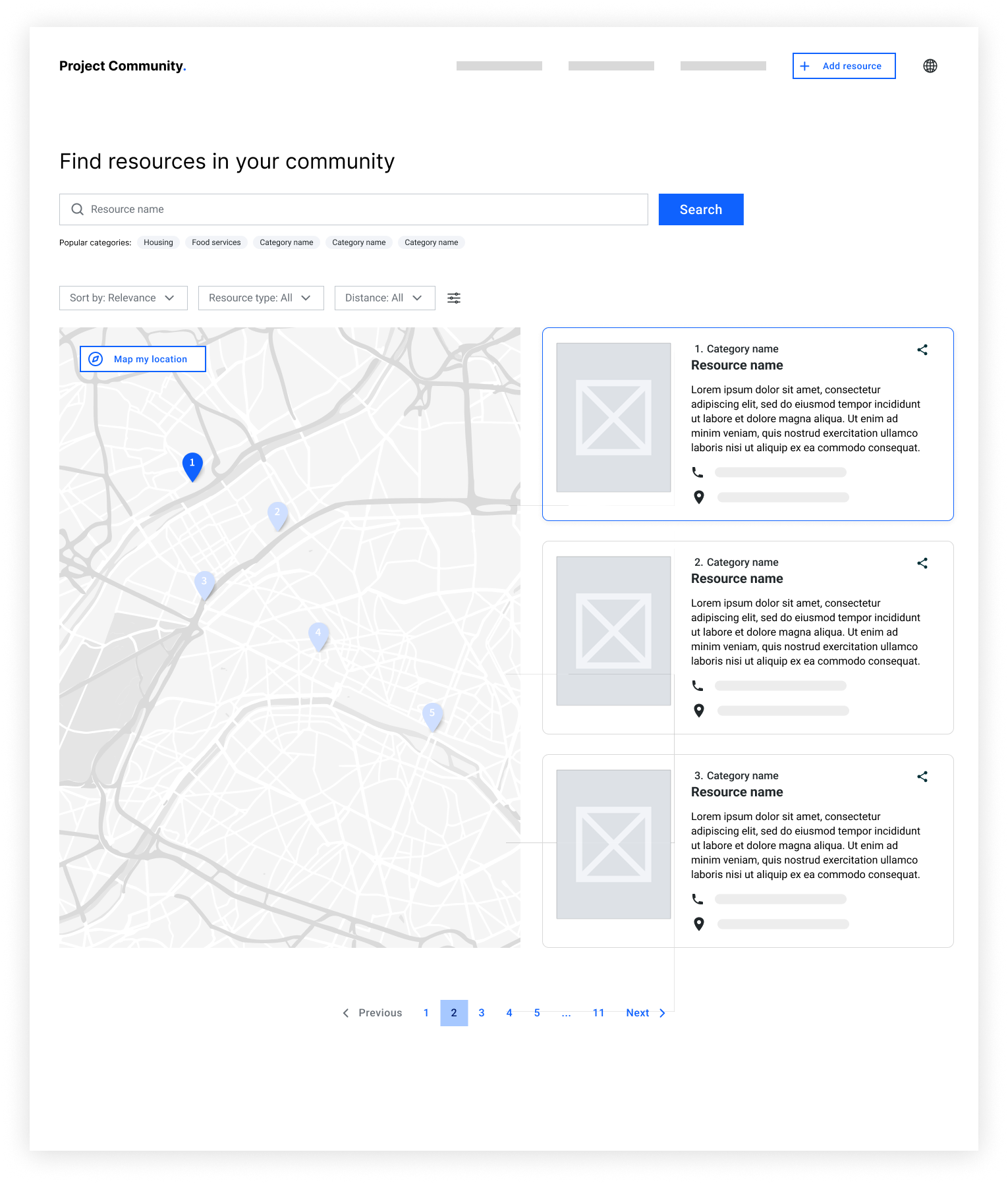
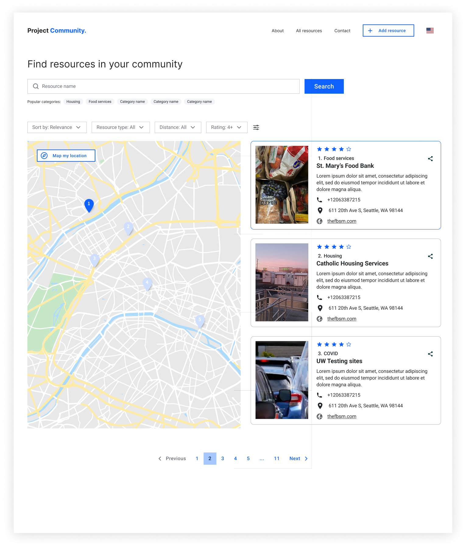
- Explored different types of layouts to surface resources, including a map visualization to help users visualize distance between resources
- Added popular categories to the search bar to generate ideas for users and ease their search experience
- Simplified card views to eliminate the need for a modal
- Added a share action to let users share resources to others
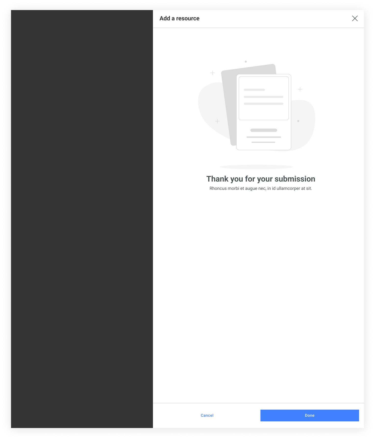
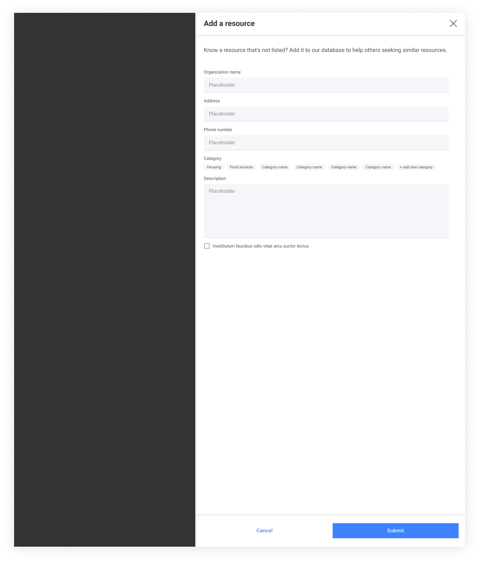
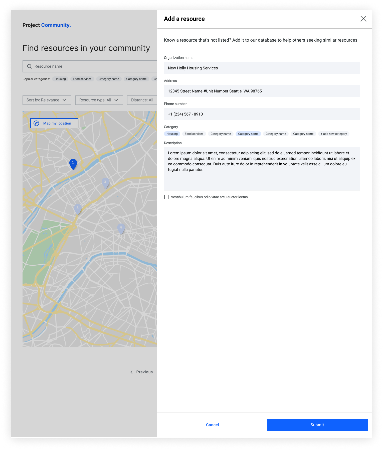
- Moved the separate add a resource page into a side panel, to enable quick action without needing to move away from their current spot
Home Page Options
To determine the optimal display for resource cards I explored four different types of layout options with various degrees of information shown.


Resource Panel Flow
To retain the context of the resource finder application, while still maintaining the simplicity of the flow, I explored a slide-out side panel instead of a modal pattern.


Final Round of User Testing & Feedback
Research study:
Launched an unmoderated usability test to:
- identify the layout option users liked the most
- validate whether or not the proposed designs effectively served user needs
- evaluate the usability of the adding a resource function
Feedback
- Users gravitated towards the map visualization the most, noting that the ability to see the resources on a map relative to where they are, alongside the numbered card list helped them identified which resources would be the most applicable to their needs
- Users liked the addition of the various features: map visualization, language selector, and ability to share
- Users wanted an ability to see resource reviewed to help them gain a better understanding of how well each resources are handled based on other user’s feedback
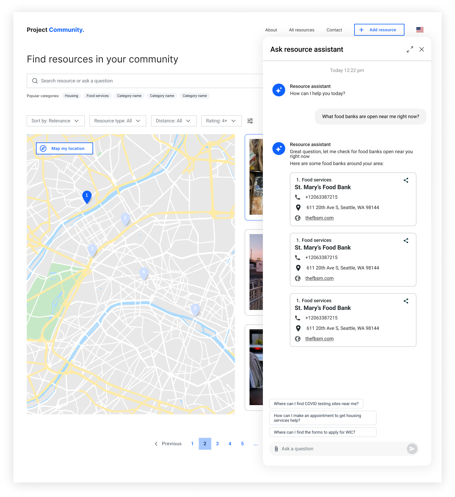
- Users had a lot of questions that were specific to each resources in addition to the general resource finding questions and noted that the ability to have a chat assistant would further help validate some of the decision making they would have to do
What was delivered?
MVP experience which included critical information for users looking for resources, including features like:
- searchable resources
- detailed resource cards
- maps with resources location
- ability to find resources relative to user’s location
- language selector to reduce barriers of access
- ability to add new resources to help expand our database for users


Next Steps
For future iterations where I can implement more complex features that will further the user experience, including:
- Resource reviews and ratings
- AI chatbox experience to help answer questions and ease the process of searching for specific resources
- User profiles to favorite and keep track of resources commonly use
